A walkthrough of one-way ANOVA using real audience survey data. Covers the F-statistic, Tukey HSD post-hoc tests, and why statistical significance isn’t the same as practical importance.
ANOVA
hypothesis testing
post-hoc tests
effect size
Author
Larry Vincent
Published
March 23, 2026
Modified
July 6, 2026
It’s 2017, and the question of who lands with whom has rarely felt sharper. The 2016 election cycle has scrambled long-held assumptions about audience taste, partisan identity, and who’s allowed to be funny about what. For anyone in entertainment whose work brushes up against politics (late-night hosts, stand-ups, podcasters, talk-show personalities) it’s a useful moment to ask a basic question: how polarizing am I, really?
Chelsea Handler is one of the more visible test cases. She’s outspoken about her politics, she’s been a presence on television for over a decade, and her brand of comedy regularly draws political reaction. But how that actually translates into audience favorability, and whether her appeal is broader or narrower than her public reputation suggests, isn’t something you can answer by reading the comments section.
This note uses survey data from a study designed to measure exactly that. Respondents were recruited online and asked to rate their attitudes on a range of political and social issues, and then to rate Chelsea Handler on overall favorability and perceived relevance. The data provided for this note contains only respondents who reported being familiar with her because there’s no point asking unfamiliar respondents how they feel about someone they don’t know.
Because political attitudes don’t always line up cleanly with party labels, the analysis team used k-means clustering on eleven issue questions to sort respondents into three audience segments. Those cluster assignments have already been calculated and are included in the dataset as segment. Your job is to determine whether those segments differ in a meaningful and statistically defensible way on favorability, and what those differences might tell us about how Chelsea actually plays across political lines.
The Data
The practice dataset (ch-talent-survey.csv) contains 595 respondents. Each row is one survey participant.
Table 1: Data dictionary
Variable
Type
Description
response_id
ID
Unique respondent identifier
segment
Factor (1–3)
Pre-assigned audience segment from cluster analysis
ch_favorability
Numeric (1–5)
Overall opinion of Chelsea Handler (1 = very unfavorable, 5 = very favorable)
ch_relevance
Numeric (1–5)
Perceived relevance of Chelsea Handler to audiences today
political_orientation
Numeric (1–5)
Political self-identification (1 = very conservative, 5 = very liberal)
The three segments have meaningfully different profiles. Segment 2 is the largest and most politically liberal group, with high scores on reproductive rights and marriage equality. Segment 3 is the most conservative, with notably lower scores on LGBT and abortion-related issues. Segment 1 sits in the middle, with a mixed issue profile that values both free speech and women’s rights.
A quick look at segment sizes and mean favorability is a good starting point:
The means are different. But are they really different? Lots of things seem different until you look closer–politicians, dating profiles, reality TV stars … oh, and also sample means.
The Issue Battery and Audience Segments
Before looking at ANOVA results, it helps to understand what went into the segmentation. Respondents rated their agreement with eleven issue statements on a 1–6 scale. These are the variables the clustering algorithm used to sort people into groups.
Table 3: Issues used for clustering
Issue
Statement Summary
right_to_choose
A woman’s right to make decisions about her own body is very important
voter_participation
More needs to be done to encourage people to participate in elections
gender_equality
Much more can be done to level the playing field for women at work and in government
free_speech
Everyone should have the absolute right to say what they choose
climate_change
Climate change is the most important issue we face
political_apathy
There should be less polarization; people should stop talking about politics so much
middle_class
The government should focus more attention on helping middle class Americans
marriage_equality
Same-sex couples should enjoy the same right to marry as heterosexual couples
roe_v_wade
A woman’s right to an abortion is under attack and people should defend Roe v. Wade
lgbt
More should be done to prevent discrimination against the LGBT community
women_in_politics
Women need a stronger voice in government
The clustering algorithm found three groups of respondents whose issue attitudes hang together in a recognizable pattern. Here is how each segment is characterized:
Reproductive rights, marriage equality, gender equality
Political disengagement
Conservatives
131
Free speech, middle class economic concerns
LGBT rights, abortion access
These segments emerged from the data. The labels are shorthand. Keep in mind that each segment contains real variation; not every Conservative scored low on every progressive issue, and not every Progressive is uniformly activated on all of them. The segment names describe the center of gravity, not every individual in the group.
What ANOVA Does
ANOVA — Analysis of Variance — compares two kinds of variation in your data.
The first is variation between groups: how far apart are the group means from one another? The second is variation within groups: how much do individuals within the same group differ from each other?
If the differences between groups are large relative to the noise inside each group, ANOVA gives you evidence that something real is going on. If the between-group differences are small relative to within-group noise, those differences could easily be explained by chance.
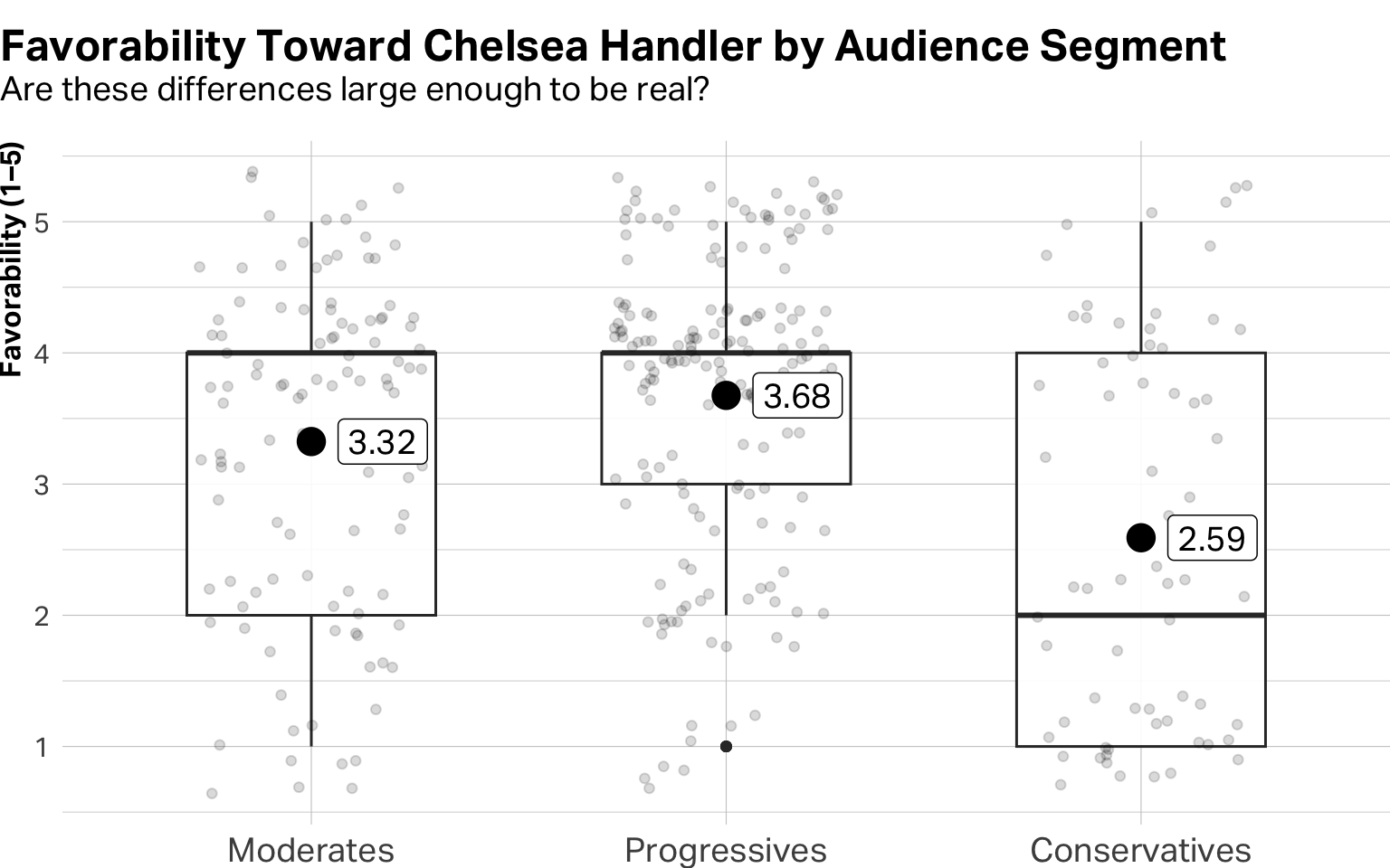
Code
df |>ggplot(aes(x = segment, y = ch_favorability)) +geom_boxplot(alpha =0.9, width =0.6, show.legend =FALSE) +geom_point(position =position_jitter(width =0.27), alpha =0.15) +stat_summary(geom ="point", size =5, shape =19, fun ="mean") +stat_summary(geom ="label", aes(label =round(after_stat(y), 2)), size =5, shape =19, fun ="mean", hjust =-0.3, fill="white", alpha =1) +labs(title ="Favorability Toward Chelsea Handler by Audience Segment",subtitle ="Are these differences large enough to be real?",x =NULL,y ="Favorability (1–5)" ) +theme(plot.title.position ="plot",plot.title =element_text(margin =margin(b=0, unit ="pt")),plot.subtitle =element_text(size =14, margin =margin(t=3, b=14, unit ="pt")),plot.margin =margin(t=12, unit ="pt"),axis.text.x =element_text(size =14),axis.title.y =element_text(face ="bold", size =12) )
Figure 1: Boxplot of ANOVA results
The F-Statistic and the P-Value
In order to understand ANOVA, we are going to have to show some formulas and discuss high-level statistics. Take a deep breath. This won’t hurt. I promise.
ANOVA produces two numbers that work together. The first is the F-statistic, which measures how large the differences between groups are relative to the variation within them. When F is well above 1, the between-group differences are outpacing the within-group noise. When it’s close to 1 or below, they’re not. A very simple way of thinking about how it is calculated looks like this:
\[F = \frac{\text{Variance Between Groups}}{\text{Variance Within Groups}}\]
The second is the p-value, which is calculated directly from F and gives us the yes-or-no verdict on significance. Think of F as measuring the size of the effect, and the p-value as telling us how surprised we should be to see an effect that large if nothing were actually going on.
By convention, a p-value below 0.05 is considered statistically significant. It basically means that if there were truly no differences, we’d see results this extreme less than 5% of the time by chance alone. Keep in mind that in the real world of business, statisticians sometimes allow for a p-value of 0.1 or lower, which is the same as saying that if there were truly no differences between the groups, we might see this kind of F value one out of 10 times.
Here’s what the ANOVA data for the favorability scores between groups in the Chelsea Handler study looks like:
Code
model <-aov(ch_favorability ~ segment, data = df)f_val <-summary(model)[[1]][["F value"]][1]p_val <-summary(model)[[1]][["Pr(>F)"]][1]summary(model)
             Df Sum Sq Mean Sq F value   Pr(>F)
segment       2   56.8  28.384   19.15 1.28e-08 ***
Residuals   350  518.8   1.482
---
Signif. codes:  0 '***' 0.001 '**' 0.01 '*' 0.05 '.' 0.1 ' ' 1
242 observations deleted due to missingness
Here’s how to read the output:
Table 5: Dictionary of ANOVA terms
Column
What It Means
Df
Degrees of freedom — reflects number of groups and respondents
Sum Sq
Total variance attributable to between-group vs. within-group differences
F value
Ratio of between-group to within-group variance
Pr(>F)
The p-value — the number you’ll report
With an F-value of 19.15 and a p-value of 0, there are indeed variances between groups and we can be very sure it isn’t random chance.
Which Groups Are Actually Different?
A significant ANOVA tells you the groups are not all the same. It doesn’t tell you which pairs of groups differ from each other. For that, you need a post-hoc test. The most common is the Tukey HSD (Fun Fact: HSD stands for “Honestly Significant Difference”) test, which compares every possible pair and controls for the fact that you’re making multiple comparisons.
Look at the Adjusted p-value column. Any pair with a value below 0.05 represents a statistically meaningful difference. All segment contrasts differ significantly. Now look at the Difference column. This tells you how much one group differs from another. Conservatives have favorability toward Chelsea that is substantially lower than that of either the Moderates or Progressives.
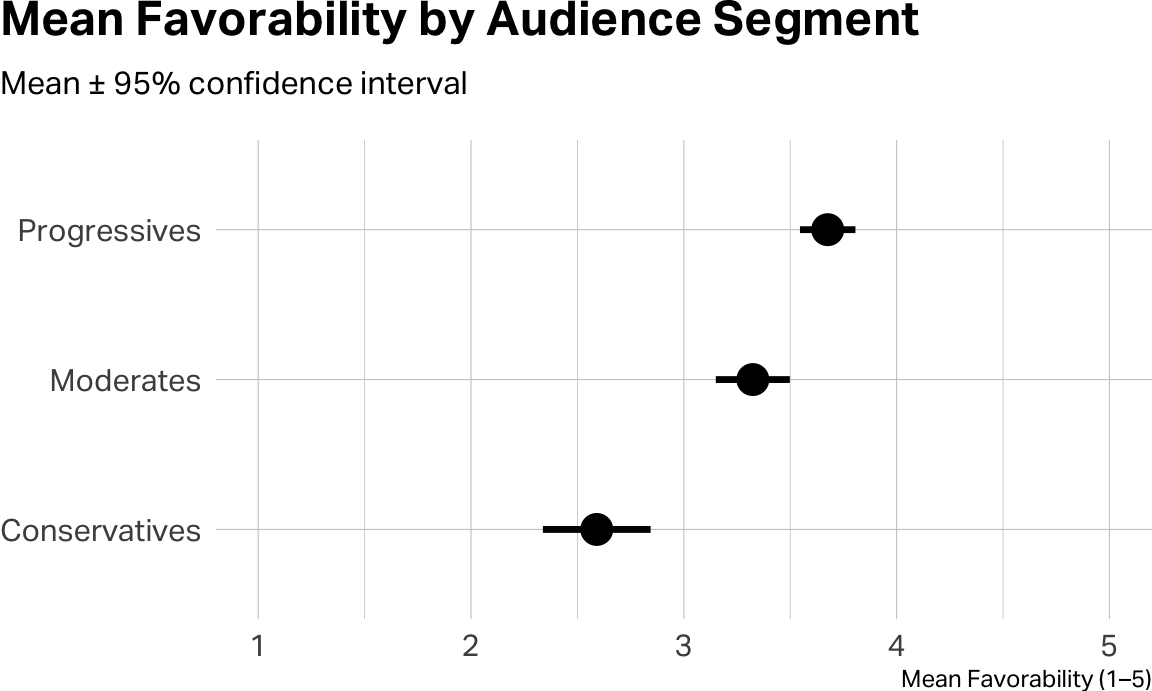
A means plot with confidence intervals puts the pairwise story on the page a little more cleanly:
Statistical Significance Is Not the Same as Importance
A significant p-value answers one question: is this real? It doesn’t answer: does this matter?
With a large enough sample, even trivially small differences will produce a significant result. This is why good researchers (like the ones I coach in my classes 😊) report effect size alongside significance. Effect size is a measure of how large the differences actually are in practical terms. You might be wondering how this is different from the Tukey HSD test we just ran. Tukey tells you which groups are significantly different from each other. It’s still basically a yes/no significance test, just applied to pairs instead of the whole model. Effect size is a different kind of question entirely. It doesn’t ask whether a difference is real. It asks whether a difference is large enough to care about. A finding can pass the Tukey test (meaning the difference between two groups is statistically real) and still represent a gap so small it wouldn’t change a single business decision.
For ANOVA, the standard effect size measure is eta-squared (η²). That is, the proportion of total variance in your outcome that is explained by group membership.
Code
eta_squared(model)
# Effect Size for ANOVA

Parameter | Eta2 |       95% CI
-------------------------------
segment   | 0.10 | [0.05, 1.00]

- One-sided CIs: upper bound fixed at [1.00].
Table 7: Interpreting eta-squared
η² Value
Conventional Interpretation
~0.01
Small effect
~0.06
Medium effect
~0.14 or above
Large effect
If η² comes back around 0.06, for instance, that means audience segment explains roughly 6% of the variance in favorability. That’s a medium effect, which is meaningful enough to inform a strategy, but a reminder that plenty of individual variation exists within each segment.
So, what do we do with all of this?
The ANOVA result quantifies something most people would have only guessed at. Chelsea Handler’s appeal is meaningfully polarized along political lines. Conservatives rate her substantially less favorably than the other two segments, and the gap is too large to dismiss as noise. The number (and the size of the effect) turns a vibes-level assertion into something that could anchor a real strategic conversation. About casting decisions. About brand partnerships. About which projects make sense and which don’t.
Notice also that ch_relevance follows an even sharper pattern than favorability. Running the same ANOVA on relevance as your outcome is a useful extension and produces an instructive comparison. Sometimes the metric that seems most important (do people like her?) is less diagnostically powerful than one that speaks to strategic fit (is she relevant to the audience you’re trying to reach?).
A Few Cautions
ANOVA assumes the observations are independent, that variances are roughly equal across groups, and that the outcome is approximately normally distributed within each group. With sample sizes like these, the normality assumption is robust. In R, you can check the equal-variance assumption with leveneTest() from the car package.
Ok. That’s enough statistics for one class. Onward.
Further Reading
Field, A. (2024). Discovering Statistics Using R and RStudio (2nd ed.). SAGE. Chapter 12 covers one-way ANOVA with the most accessible writing you’ll find in a statistics textbook.
Gravetter, F. J., & Wallnau, L. B. (2022). Statistics for the Behavioral Sciences (11th ed.). Cengage. The standard reference for ANOVA in social science survey contexts, with worked examples throughout.
AI Exploration Prompts
The point of these prompts is to make you think harder, not to outsource the thinking. Resist the urge to ask AI to explain the note to you. Use it instead to pressure-test what you already understand.
Teach it back.
Without looking at the note, explain to an AI (in your own words) what eta-squared measures and why it exists separately from a p-value. When it asks follow-up questions, answer them without re-reading. Then ask AI to identify any place your explanation was imprecise or missed something important. (The goal is to find the gap between “I read this” and “I understand this.”)
Defend a decision.
Paste the Tukey output and the eta-squared result from this note into a chat. Tell AI: “I’m presenting this to a skeptical brand manager who thinks the segment differences are too small to act on. Steelman her objection. What’s the strongest version of the argument against my interpretation?” Then write your response.
Find the weakest link.
Ask AI: “Identify the weakest inference in this note. Where does the author make a leap that the statistics shown don’t fully support?” Evaluate whether AI’s answer is right. If you disagree, push back and defend the note. If you agree, articulate what additional analysis would close the gap.
Generate a test case.
Describe a research scenario from your own work or interests where ANOVA would be the right tool. Ask AI to critique your proposed design. Where is your hypothetical study underpowered, confounded, or measuring the wrong thing? Revise.